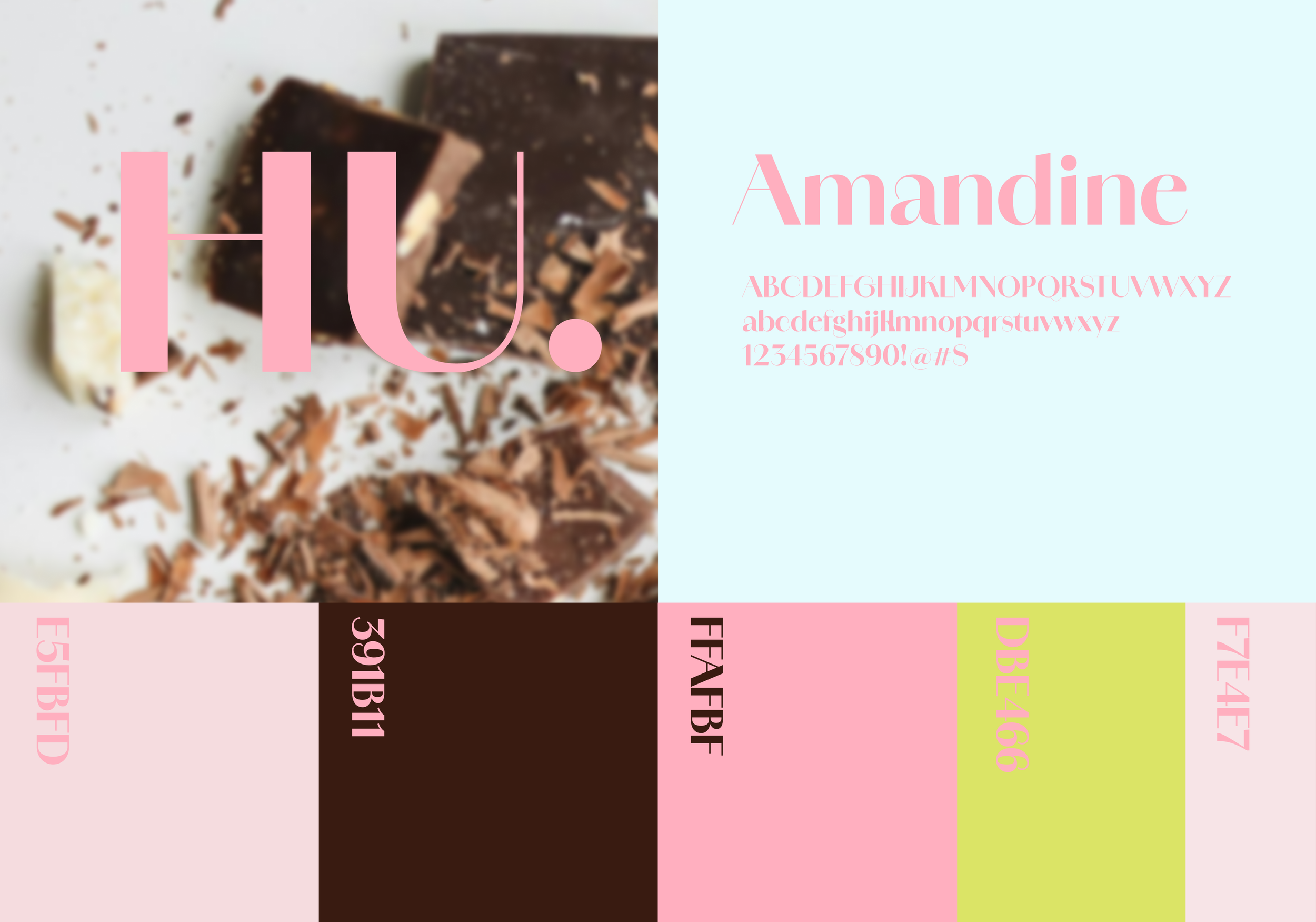
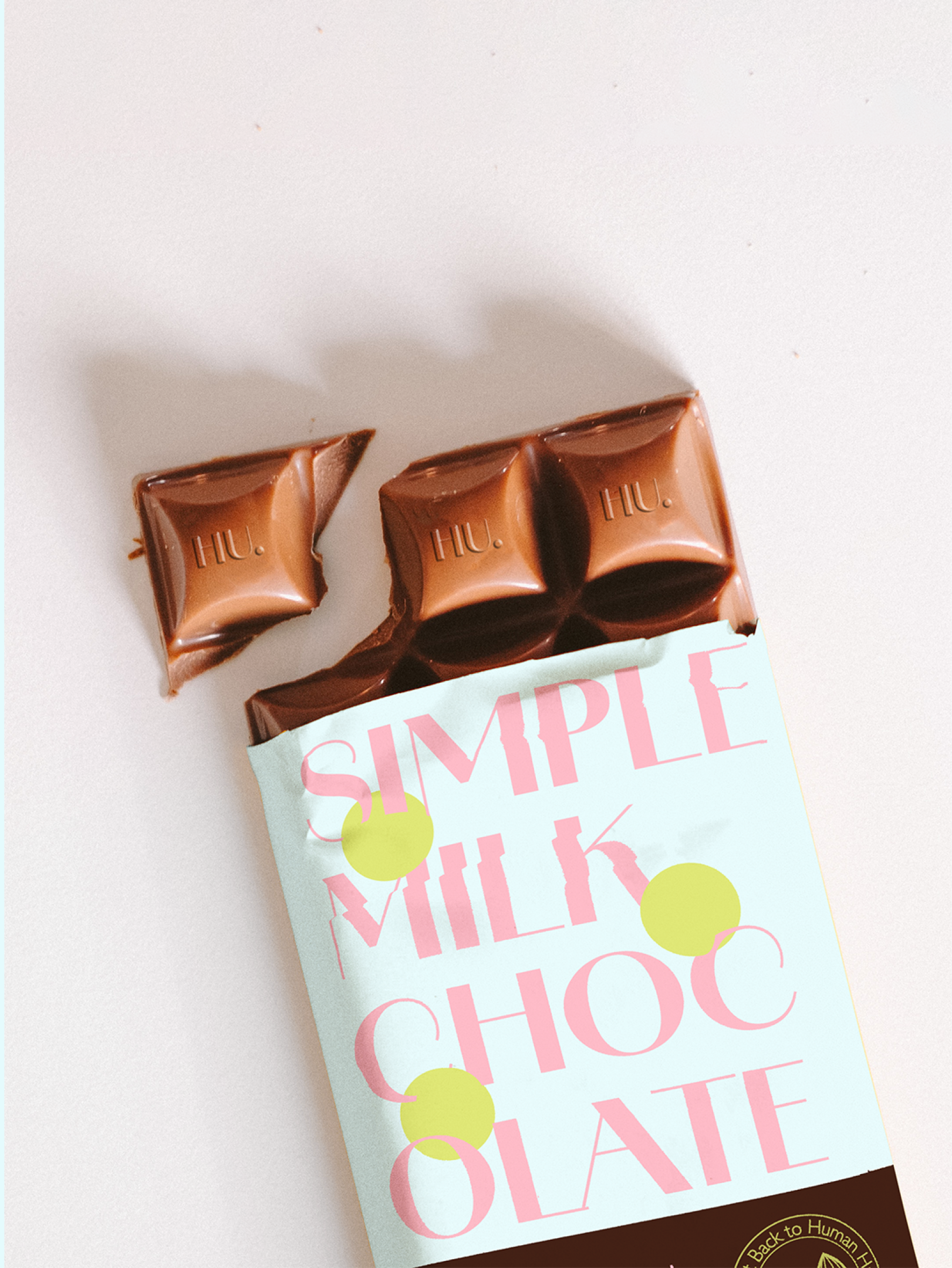
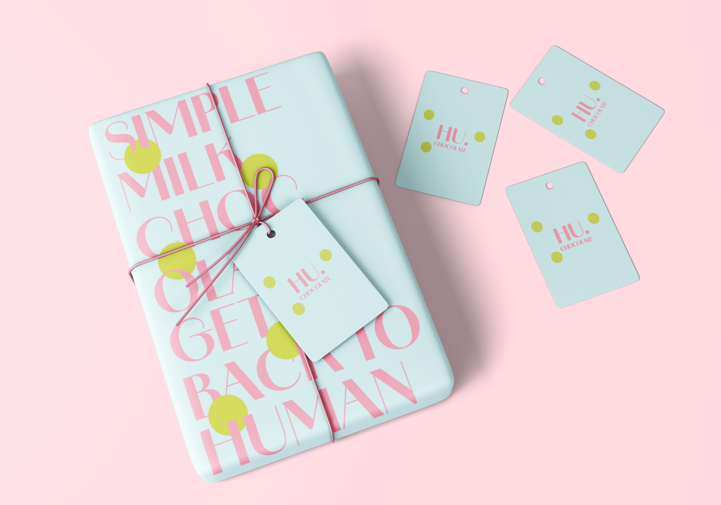
I redesigned the packaging for HU Chocolate to enhance shelf visibility while staying true to the brand’s “Get Back to Human” identity. Based on research of the existing packaging, I addressed issues such as limited color variation, small text, and a lack of distinctive visual elements by introducing bold typography, soft pastel colors, and modern graphic details. Throughout the process, I focused on maintaining a balance between simplicity and expressiveness, ensuring that the redesign felt both fresh and familiar. The final outcome strengthens brand recognition while allowing the product to stand out more clearly in a competitive retail environment.
Tool Illustrator, Photoshop
Type Package Design
Industry Food
Duration 3 Weeks
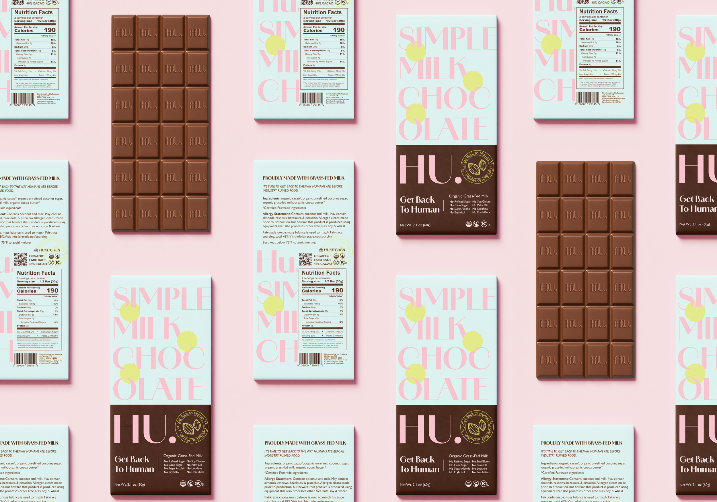
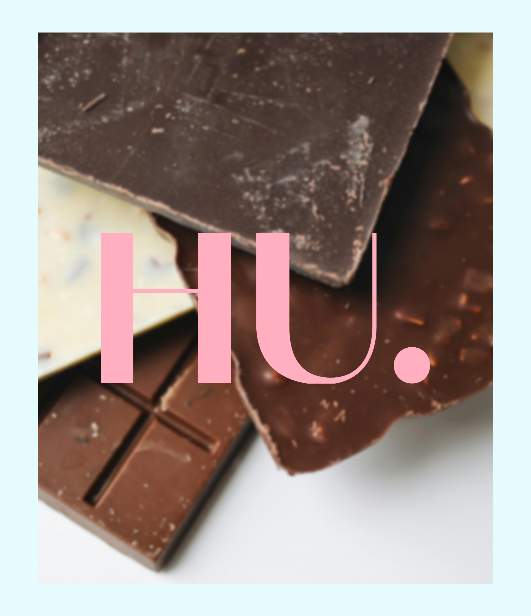
HU. Chocolate
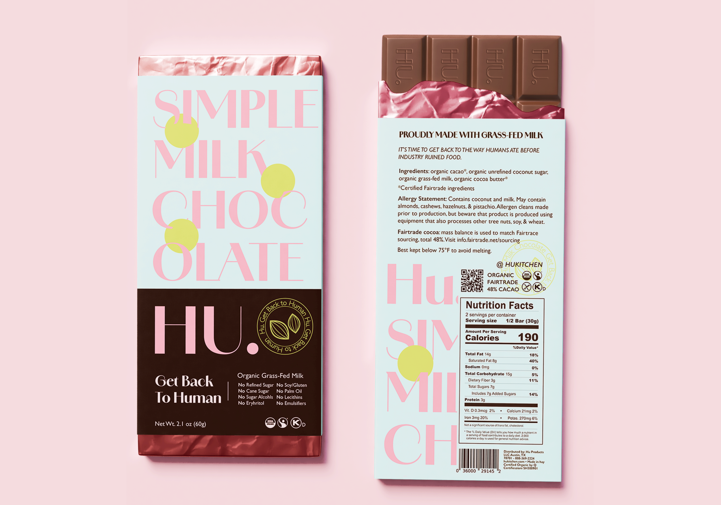
Front and back packaging display
“At the beginning of the project, I was hesitant to push the visual language too far, worrying that stronger colors might compromise the brand’s minimal identity.”
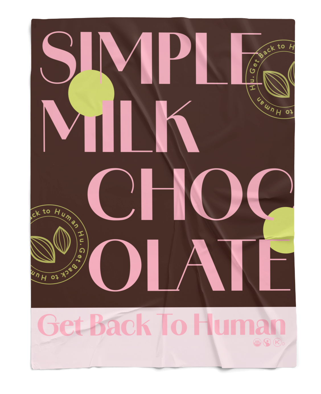
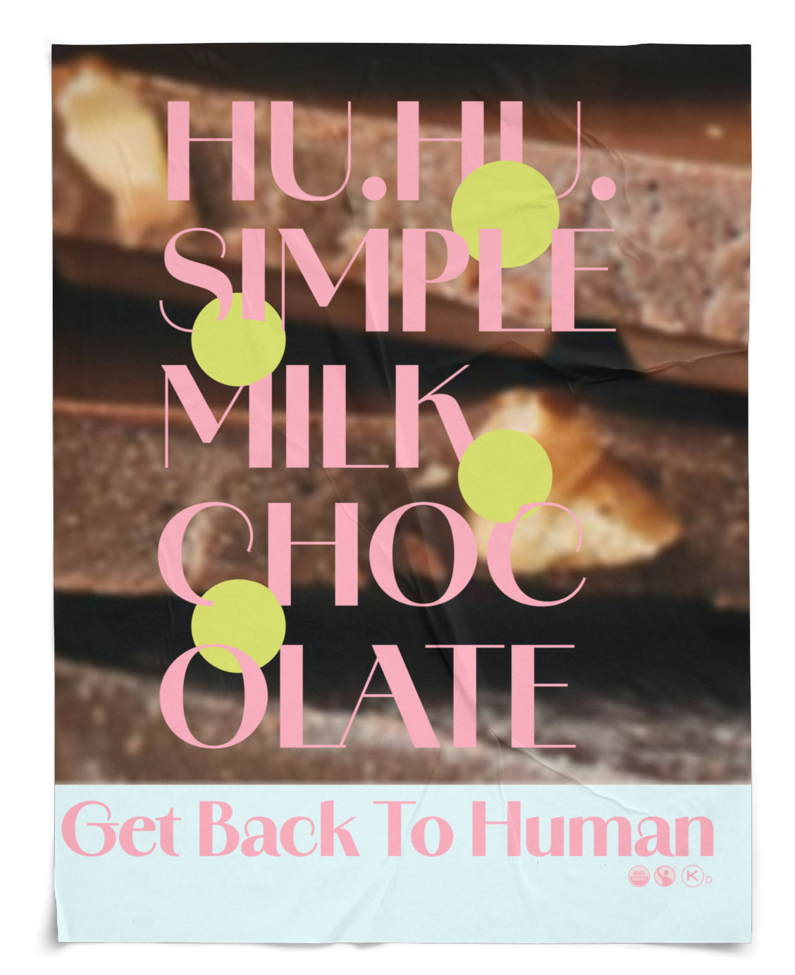
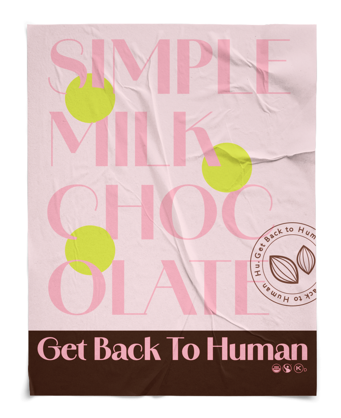
Poster Display
“As the process unfolded, I began to see minimalism not as a limitation, but as a framework that could support bolder choices when used intentionally. Through research and iterative testing, I learned that color and typography could enhance clarity and shelf presence without diluting the brand’s core values.”
Style Sheet